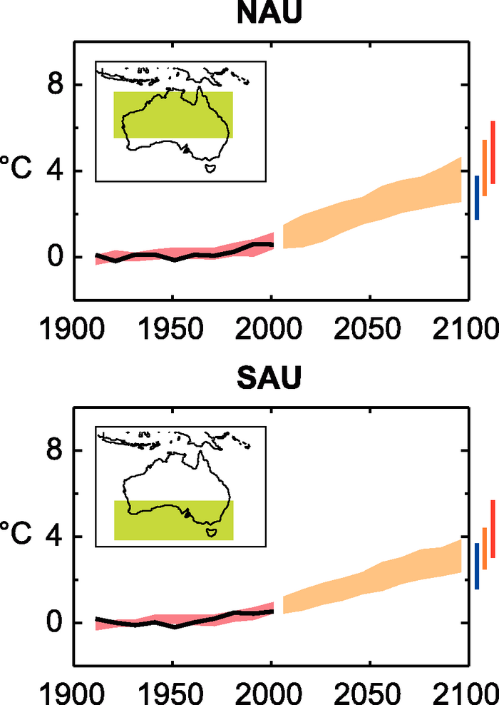
Figure 11.16. Temperature anomalies with respect to 1901 to 1950 for two Australian land regions for 1906 to 2005 (black line) and as simulated (red envelope) by MMD models incorporating known forcings; and as projected for 2001 to 2100 by MMD models for the A1B scenario (orange envelope). The bars at the end of the orange envelope represent the range of projected changes for 2091 to 2100 for the B1 scenario (blue), the A1B scenario (orange) and the A2 scenario (red). More details on the construction of these figures are given in Box 11.1 and Section 11.1.2 .