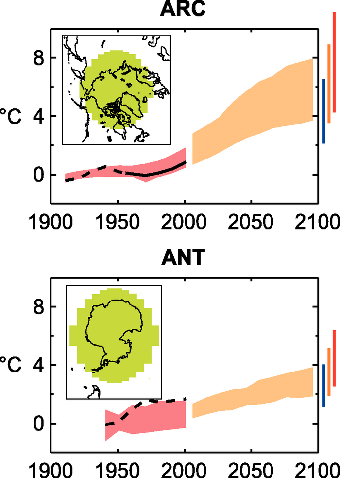
Figure 11.18. Top panels: Temperature anomalies with respect to 1901 to 1950 for the whole Arctic for 1906 to 2005 (black line) as simulated (red envelope) by MMD models incorporating known forcings; and as projected for 2001 to 2100 by MMD models for the A1B scenario (orange envelope). The bars at the end of the orange envelope represent the range of projected changes for 2091 to 2100 for the B1 scenario (blue), the A1B scenario (orange) and the A2 scenario (red). The black line is dashed where observations are present for less than 50% of the area in the decade concerned. Bottom panels: The same for Antarctic land, but with observations for 1936 to 2005 and anomalies calculated with respect to 1951 to 2000. More details on the construction of these figures are given in Box 11.1 and Section 11.1.2 .