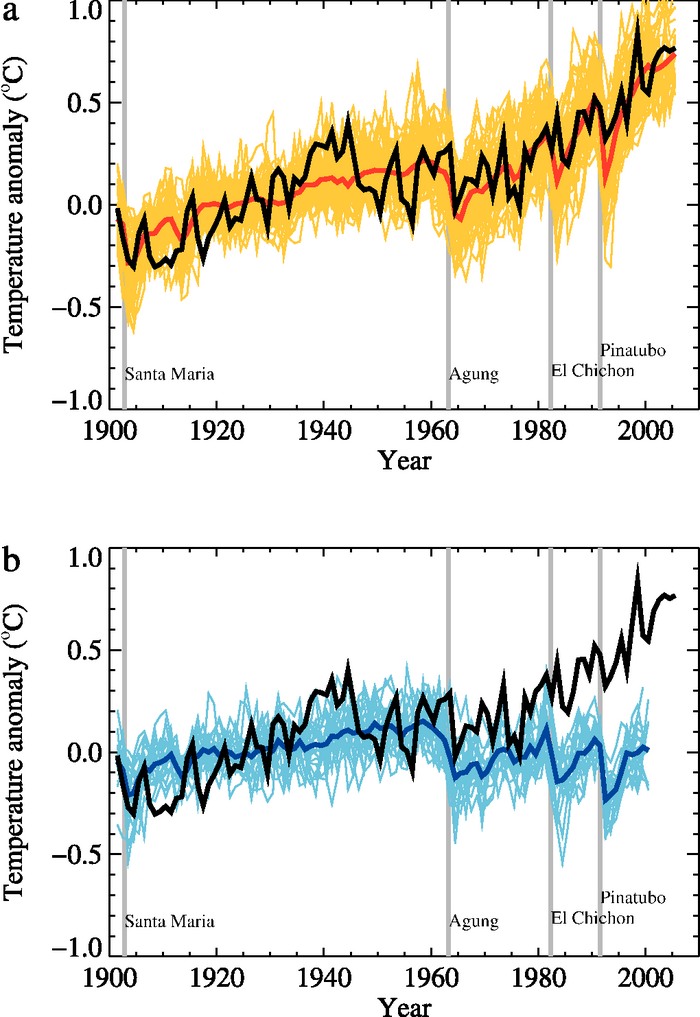
Figure 9.5. Comparison between global mean surface temperature anomalies (°C) from observations (black) and AOGCM simulations forced with (a) both anthropogenic and natural forcings and (b) natural forcings only. All data are shown as global mean temperature anomalies relative to the period 1901 to 1950, as observed (black, Hadley Centre/Climatic Research Unit gridded surface temperature data set (HadCRUT3); Brohan et al., 2006) and, in (a) as obtained from 58 simulations produced by 14 models with both anthropogenic and natural forcings. The multi-model ensemble mean is shown as a thick red curve and individual simulations are shown as thin yellow curves. Vertical grey lines indicate the timing of major volcanic events. Those simulations that ended before 2005 were extended to 2005 by using the first few years of the IPCC Special Report on Emission Scenarios (SRES) A1B scenario simulations that continued from the respective 20th-century simulations, where available. The simulated global mean temperature anomalies in (b) are from 19 simulations produced by five models with natural forcings only. The multi-model ensemble mean is shown as a thick blue curve and individual simulations are shown as thin blue curves. Simulations are selected that do not exhibit excessive drift in their control simulations (no more than 0.2°C per century). Each simulation was sampled so that coverage corresponds to that of the observations. Further details of the models included and the methodology for producing this figure are given in the Supplementary Material, Appendix 9.C . After Stott et al. (2006b).