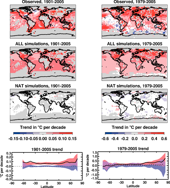
Figure 9.6. Trends in observed and simulated temperature changes (°C) over the 1901 to 2005 (left column) and 1979 to 2005 (right column) periods. First row: trends in observed temperature changes (Hadley Centre/Climatic Research Unit gridded surface temperature data set (HadCRUT3), Brohan et al., 2006). Second row: average trends in 58 historical simulations from 14 climate models including both anthropogenic and natural forcings. Third row: average trends in 19 historical simulations from five climate models including natural forcings only. Grey shading in top three rows indicates regions where there are insufficient observed data to calculate a trend for that grid box (see Supplementary Material, Appendix 9.C for further details of data exclusion criteria). Fourth row: average trends for each latitude; observed trends are indicated by solid black curves. Red shading indicates the middle 90% range of trend estimates from the 58 simulations including both anthropogenic and natural forcings (estimated as the range between 4th and 55th of the 58 ranked simulations); blue shading indicates the middle 90% range of trend estimates from the 19 simulations with natural forcings only (estimated as the range between 2nd and 18th of the 19 ranked simulations); for comparison, the dotted black curve in the right-hand plot shows the observed 1901 to 2005 trend. Note that scales are different between columns. The ‘ALL’ simulations were extended to 2005 by adding their IPCC Special Report on Emission Scenarios (SRES) A1B continuation runs where available. Where not available, and in the case of the ‘NAT’ simulations, the mean for the 1996 to 2005 decade was estimated using model output from 1996 to the end of the available runs. In all plots, each climate simulation was sampled so that coverage corresponds to that of the observations. Further details of the models included and the methodology for producing this figure are given in the Supplementary Material, Appendix 9.C .